Showing posts with label design. Show all posts

Sunday, August 7, 2011

Google Sites increases sustainability of student organization websites

When I was handed the position of Webmaster for our Student Development Organization, I had to request access to the university's FTP server with my Blackboard user ID. After a day or so, an administrator finally granted me permission to our student organization's designated webspace. To modify our current site, I would have to download an HTML editor and an FTP client. Furthermore, our URL would always be long and unappealing (http://www.bgsu.edu/studentlife/organizations/bla/bla/bla).

In the late 1990's, free webspace on the university's servers might have been an appealing offer, but unfortunately even the latest upgrades to their content management system have not kept up with the user-friendly features of Google Sites.

An important feature of any student organization website is sustainability. By this, I don't mean how "green" the page is, but how easy it is to hand down to the next cohort of students. Rather than submitting a request to IT to have them grant administrative access to a select portion of their FTP server, we have a simple login to our Google account that hosts online documents, a calendar, email, and website - all for free!

When it comes to the design itself, Google Sites offers amazing features that allow you to easily embed Google documents, forms, and calendars directly on the pages. Webmasters need only know how to operate a word processor, because all of the tables, columns, and wrappers are adjustable with a slide bar - no coding required.
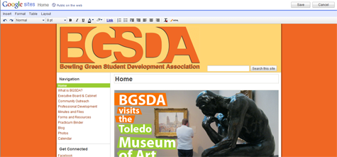
Google Sites increases sustainability of student organization websites

Because of its ease of use, Google Sites increases the chances that a student in the next cohort has the know-how to keep the site going.

Google Sites increases sustainability of student organization websites

It seems that student organization webpages go through generations, as capable webmasters come and go. I was able to find 3 past generations of my own student org's page, each created and maintained by a different student. Undoubtedly, each student created a page as they saw fit, using the tools they were familiar with. When they left, the site left with them. Hopefully Google Sites can break the cycle, because there are no original files located on a personal hard drive, the interface is simple and inviting, and Google provides adequate support for common problems and questions.


I suppose only time will tell if my own Google Site lasts more than one 'generation' of transitions, but I have high hopes. And I'm not surprised to see more and more student organizations, programs, and offices creating their own sites on Google.

What I learned: Don't re-invent the wheel, just Google it. 

Interfraternity Council logo upgrade

I'm no logo guru, but I do enjoy using Photoshop to enhance, simplify, and upgrade images. A friend of mine was working on a header image for an Interfraternity Council website built with Google Sites.

I'm a big advocate for branding offices, organizations, and services with standard fonts and even logos to help students quickly recognize and identify what they see online. Even if you already have a logo for your college or department, it wouldn't hurt to come up with a standard font that you always use to refer to your office.

In this case, the IFC webpage already had a rudimentary logo. It was a pixelated GIF image, but there was an honest attempt to brand the webpage with a recognizable symbol of a laurel surrounding the IFC acronym.

Interfraternity Council logo

Simplicity is key on Google Sites, and I try to emphasize clean lines and plenty of negative space. I decided to try my hand at upgrading the header to give the site a more professional appearance. I found a laurel image that I liked online, and traced it with the pen tool to create a vector laurel outline. I incorporated the same layout, but dropped the solid white rectangle in the 'logo' image. Here is what the finished product looks like:

Interfraternity Council logo

There really wasn't much design that went into this project, because all the elements were already there. I made the entire image larger to make it more dominant as a header, added a bit of drop shadow to give it a little depth, and dropped in the vector laurel that made everything look much cleaner, and more professional.

What I learned: If a picture is worth 1000 words, a logo header is worth volumes.


Thanks to @ericteske for the help on our new website logo www.tinyurl.com/onuifc. Great ideas on branding via his blog http://t.co/11VSRLLless than a minute ago via Tweet Button Favorite Retweet Reply

Foursquare relaunches university campaign including free custom badge program

Foursquare relaunches university campaign

I just found out about foursquare's expanding features for colleges and universities. On July 25, the foursquare blog made three major announcements about their Universities 2.0 campaign:
  1. The launch of their new (FREE) custom badge program for university partners who want to deeply incorporate and promote the use of foursquare on campus.
  2. An invitation for college foursquare account holders to get in touch with the company through a Google form.
  3. The relaunch of a university ambassador program for enthusiastic students (like me!). 
Students can sign up for the ambassador program through a Google form, similar to the contact form used for school account representatives. 

Aside from the custom college badges, foursquare has been offering a set of campus-specific badges since last year, including a Bookworm Bender badge for checking in to an academic building after midnight, and a Munchies badge for checking in to 5 different dining halls.

I don't know who is supposed to be on top of this at BGSU, but somebody already owns a university foursquare account. It looks like I can hope to become an ambassador, maybe get a free t-shirt, and continue to be a foursquare fan. I wish I knew who owned the BGSU account so I could tell them to take advantage of this opportunity to foursquare-ify the campus for real!

The fact that I won't have administrative rule over a university foursquare account doesn't mean I can't fantasize about what the custom badge might look like. Here are some unauthorized samples I came up with:


Hey, even if these don't turn out to be what the eventual foursquare badge looks like, these would make some killer BGSU guitar picks!

What I learned: Enthusiasm doesn't equal authority.

Friday, July 29, 2011

Inspiration for Department of Higher Education and Student Affairs Logo

We're planning on making some HESA (Higher Education and Student Affairs) merchandise for our department as a culture stimulating fundraiser. I was trying to come up with some ideas for a design that would work on a t-shirt or coffee mug, and I realized it's incredibly difficult to design something for an academic department in higher education.

I wanted to avoid a mortarboard, and I didn't think an apple with a worm coming out of it was reflective of our maturity (some would argue that point). I looked online for inspiration and got some ideas that I'll share below. For the sake of anyone out there in cyberspace trying to design a logo for higher education and student affairs academic department merchandise, please learn from my trial and error!

1. Venn Diagram 

The idea here, if it isn't obvious, is that our department merges higher education and student affairs. Hence, Venn diagram.

2. Alphabet Soup

We use a lot of acronyms, or as I like to say WUALOA's (nobody really says this).

3. Mountain Climbers

This one was inspired by motivational clip art of a mountain climber giving a helping hand. It's very philosophical, and implies that the department reaches out to help students succeed. However, my stick figure at the bottom looks more like he's falling into nothingness.

4. LED Lights

If our department were the set of a Madonna video, this would be perfect!

5. Quill

Quills have to do with writing, and yes we do write from time to time. But this looks more like a publishing company logo.

6. Tetris

Ah yes, Tetris. This goes back to the Venn diagram as it implies that higher education and student affairs complete one another. Side note: I never realized the Tetris box said "From Russia with Fun!" on it...

7. Stylized Building

When in doubt, just make a picture of your building. It automatically has something to do with your department, because that's where you are.

From what I can tell so far, we like the building logo. With a few modifications, we should be able to make the majority of people happy with the look of our department merchandise.

What I learned: When in doubt, draw the building.