Saturday, July 30, 2011

Printable before and after Photoshop photos from magazines for Body Image presentation

Printable before and after Photoshop photos from magazines for Body Image presentation

Last week, I gave a presentation on alcohol awareness and body image to a group of 16-17 year old girls. I wanted to find some visuals to bring with me to prove how much Photoshop work is done to cover models, and that this ideal level of beauty is unattainable (even for the models themselves).

To save you some time, I've included the full size images in this post, so you can print them out and use them for your own educational presentations.

First up, we have a cover model for Nitro Magazine. This is one of the best examples of before-and-after Photoshop images I was able to find, and luckily they are high enough resolution to be printed as a full page image. Click on the images to download the high-res versions.

Printable before and after Photoshop photos from magazines for Body Image presentationPrintable before and after Photoshop photos from magazines for Body Image presentation

When I showed these images to the group, I started with the after after photo, and then showed them the before photo. Their reaction was interesting, I heard "ewww she's ugly" and "she's sooooo old!" I challenged this viewpoint and said she's only old and ugly compared to this painting of herself - this is how she really looks. This is how normal people look.

Nichkhun photoshop abs mistakeNext, I showed the group that not only women are Photoshopped in magazines. I found this great image of model "Nichkhun" where the editors went a little overboard on his abs, resulting in the loss of his belly-button.


The point here is not that removing his belly-button makes him more attractive (it doesn't), but that the editors were so Photoshop-crazy that they just glossed right over it!


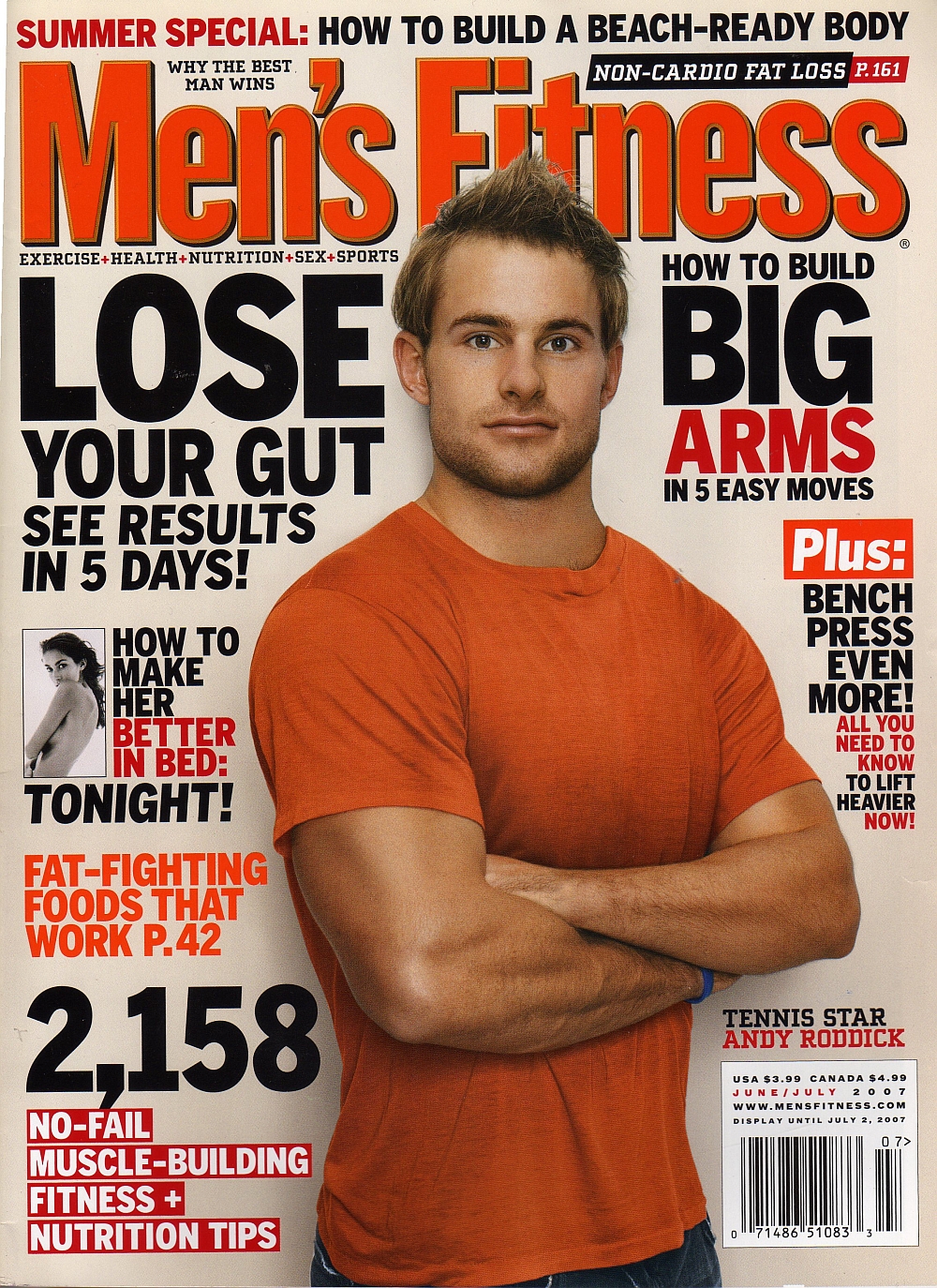
Finally, here is another Photoshop-failure classic. It's Men's Fitness magazine with Andy Roddick on the cover. Andy was so shocked by the final cover, that he didn't even recognize himself.
"Little did I know I have 22-inch guns and a disappearing birth mark on my right arm. I saw the cover for the first time when I landed after Rome [tournament]. It was pretty funny.
"I walked by the newsstand in the airport and did a total double take. I can barely figure out how to work the red-eye tool on my digital camera. Whoever did this has mad skills" (source).
I don't have the original image of the cover, but there is an obvious difference in the size of his arms compared to this "normal" photo of Andy playing tennis.
andy roddick Printable before and after Photoshop photos from magazines for Body Image presentationandy roddick Printable before and after Photoshop photos from magazines for Body Image presentation

What I learned: A picture is worth a thousand words.

Friday, July 29, 2011

Inspiration for Department of Higher Education and Student Affairs Logo

We're planning on making some HESA (Higher Education and Student Affairs) merchandise for our department as a culture stimulating fundraiser. I was trying to come up with some ideas for a design that would work on a t-shirt or coffee mug, and I realized it's incredibly difficult to design something for an academic department in higher education.

I wanted to avoid a mortarboard, and I didn't think an apple with a worm coming out of it was reflective of our maturity (some would argue that point). I looked online for inspiration and got some ideas that I'll share below. For the sake of anyone out there in cyberspace trying to design a logo for higher education and student affairs academic department merchandise, please learn from my trial and error!

1. Venn Diagram 

The idea here, if it isn't obvious, is that our department merges higher education and student affairs. Hence, Venn diagram.

2. Alphabet Soup

We use a lot of acronyms, or as I like to say WUALOA's (nobody really says this).

3. Mountain Climbers

This one was inspired by motivational clip art of a mountain climber giving a helping hand. It's very philosophical, and implies that the department reaches out to help students succeed. However, my stick figure at the bottom looks more like he's falling into nothingness.

4. LED Lights

If our department were the set of a Madonna video, this would be perfect!

5. Quill

Quills have to do with writing, and yes we do write from time to time. But this looks more like a publishing company logo.

6. Tetris

Ah yes, Tetris. This goes back to the Venn diagram as it implies that higher education and student affairs complete one another. Side note: I never realized the Tetris box said "From Russia with Fun!" on it...

7. Stylized Building

When in doubt, just make a picture of your building. It automatically has something to do with your department, because that's where you are.

From what I can tell so far, we like the building logo. With a few modifications, we should be able to make the majority of people happy with the look of our department merchandise.

What I learned: When in doubt, draw the building.

QR Codes and About.Me, One Thing Leads To Another (Literally)

I was playing around with QR codes for the first time last night, because I just downloaded a free QR Code Reader app for my iPhone. QR codes are two dimensional bits of code that can create hyperlinks printed on physical objects. I figured someone claiming to be techy would have a QR code on their business cards by now, so that led me to my next question. How do you make one?

qrcode A quick Google search solved that problem, as there are a number of QR code generators out there. I used Kaywa for this one. You can also try Qurify for text only messages, or QRstuff.com for more complex codes like contact information or calendar events.

I'm not sure if the general population really knows what to do with these yet, but they are definitely becoming more prevalent. I do have some concerns with accessibility, however, because putting this square barcode on your business card is like saying "you have to own a smartphone with a camera to get to know me."

So great, now I know how to make one - but where should I have my QR code link point to? This blog? Well, out of context it might be a little abrupt (see penis model post). I needed to establish some context first, so I decided to create an about.me landing page that links to all of my virtual identities.


Once I linked my about.me page to LinkedIn, I realized my resume and profile photos were outdated. So, the simple project of making a QR code led to creating an about.me profile, which led to updating my resume.

What I learned: When it comes to QR codes, one thing literally leads to another.

Sunday, July 17, 2011

Class of 2015 Facebook page turned promotional land-grab


Bowling Green State University made a Facebook page for the incoming Class of 2015 that has received a rush of attention. This page has turned into an invaluable forum for conversing with students who are navigating Orientation, networking with each other, or just sharing their excitement.

Looking back, the Class of 2013 page has only 474 Likes, and the subsequent Class of 2014 page saw a jump to 2,806 Likes, but the Class of 2015 page already has 2,942 Likes.

Aside from fostering interactions between future students, the Facebook page has turned into a customer service live chat. Students have been asking how to change majors, or where to buy the summer reading book.

But what's really interesting is watching the various student organizations, club sports, and fraternities and sororities post promotional messages onto the page's wall. It's like a Facebook land-grab for new students who have yet to arrive. I have to admit that I've tried my hand at tapping into this huge population of optimistic students with some mentions of the Student Wellness Network, and advertising a class that only has two students enrolled.


At this point, the population of first-year students hasn't been abused with spam too heavily, and don't seem to mind the occasional solicitation. So I say we all take advantage of this captive audience while we can! If you don't know how to post as your page to another page, read below.

To use Facebook as one of your existing pages, first go to the page that you want to post to and add the page to your page's favorites.


Next, click on the link in the right-hand navigation on your own page. As an example, here is the link to "Use Facebook as BGSU's Student Wellness Network" that I see when I visit my own student group Facebook page.


As long as your page "Likes" the page you're trying to post to, and you are using Facebook as your page, you can post on their wall in the same way you share with friends.

What I Learned: Why wait for new students to get to campus before spamming them?

Intramural Battleship at the University of Alabama [VIDEO]


This video is filmed like an epic movie trailer for a new intramural sport called Battleship. The objective is to sink your competitors' boats by throwing buckets of water into their canoes. It looks like there is a member of each team with a shield to block some of the water.

Based on a quick Google search, it looks like there are a dozen or so universities with Intramural Battleship. Fun!

What I learned: Intramural sports are as fun as you make them.